
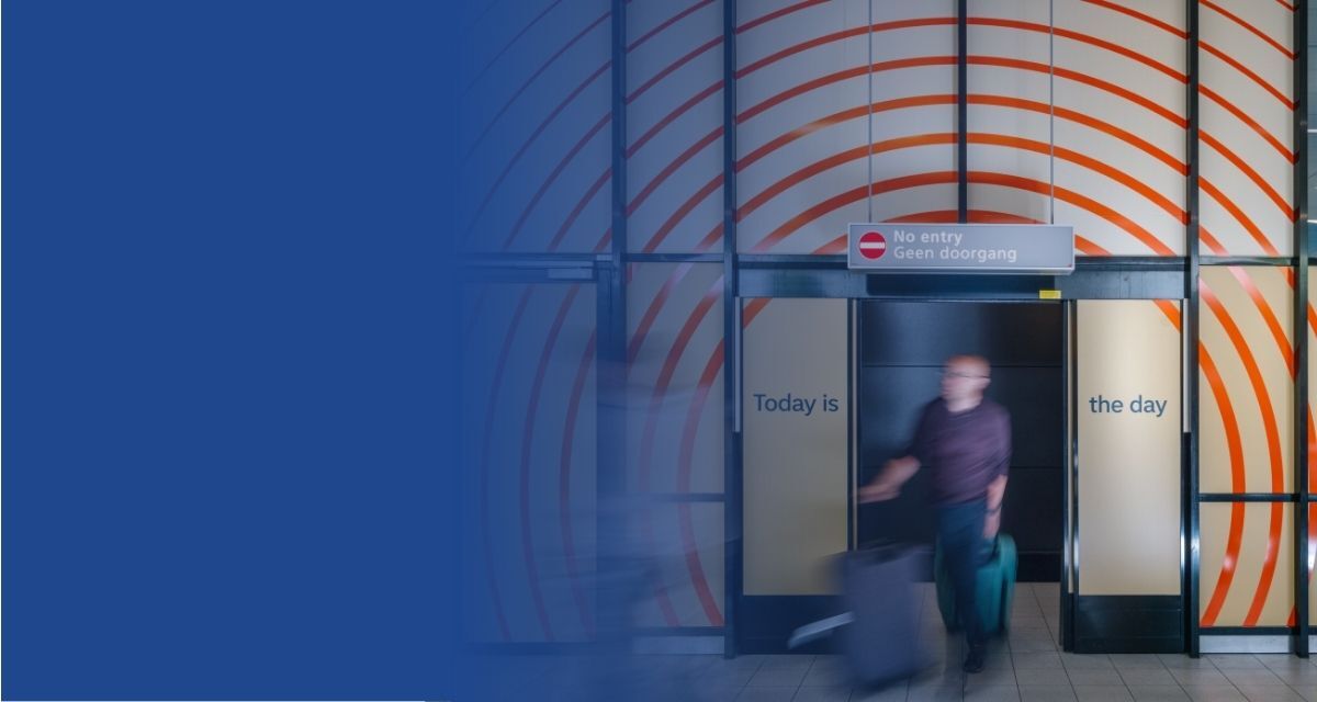
| (Above) Amsterdam Airport Schiphol, known informally as Schiphol, is the main international airport of the Netherlands. Photo credit: thonik |
When you think about trust, you probably don't picture an airport. Especially not a busy international hub like Schiphol in Amsterdam.
Picture it: you just stepped off your plane after a long flight. Your body is disoriented from the jet lag and your mind is foggy from lack of sleep. It’s loud, crowded, and full of signs competing for your attention. You can’t immediately place where you are, and you’re worried you won’t make it in time for your connection.
In this moment, you need orientation. Something to signal, without words, that you’re in the right place.
This is the starting point for Dutch design studio thonik, whose design identity work for Schiphol helps millions of travelers every year feel more at ease in one of the world’s busiest airports. Their premise is simple—trust is something you feel long before you can articulate it.
Environmental neuroscience reinforces this idea: the built environment continually interacts with the brain, influencing attention, stress responses, and emotional regulation in ways we often feel before we understand.
Trust, in other words, is not abstract. It begins in the body and is built through the signals that shape how people move, feel, and belong.
This raises an important question for business leaders: What would it look like to design the places where we work (and all our systems) to create trust?
The emotional infrastructure of trust
“The way things look, the way things are designed, really gets under your skin,” explains thonik Creative Directors Nikki Gonnissen and Thomas Widdershoven. “It helps you feel at home in a situation, understand it, feel at ease—and trust it.”

Across their work creating graphic identities for largescale global projects like museums and foundations, thonik has three core principles that anchor their design approach:
1. Clarity: People must understand where they are and who is speaking to them.
Systems that communicate in contradictory or fragmented ways erode confidence. Clarity is not merely aesthetic, it is informational safety. When a sign, symbol, or pattern does exactly what people expect it to do, trust accumulates.
2. Coherence: One system, one voice.
Fragmentation in an environment, whether that’s multiple logos, typefaces, or messaging styles, can make a system feel unpredictable, even if each individual component is well designed. Coherence, by contrast, builds psychological safety. It tells people the system is unified, stable, and governable under one design philosophy.
3. Calm: Visual noise raises cognitive load, while visual restraint lowers anxiety.
Humans are wired to process environmental cues before intellectual ones. Busy, stimulus-heavy environments activate threat responses. Calm, intentional design dampens them. A palette, a boundary, a rhythm of spacing. Each tells the body, “You’re okay.”
Schiphol Airport: Orientation as psychological safety
As the main international airport in the Netherlands, Schiphol Airport is a busy place with many visual inputs competing for your attention.
While the name “Schiphol” is mostly associated with the airport, it also refers to the small geographic location in which it resides. Local businesses and transportation hubs not affiliated with the airport use the name as well.
For international travelers encountering the Dutch language for the first time, the word became a source of confusion rather than clarity. Was this part of the airport system? Who was in charge? Was that sign official, or just branding for a one-off parking company?
thonik reframed the challenge: before people can trust a place, they must be able to recognize it.
Step 1: Clarify identity
Their first intervention was deceptively simple: incorporate the airport code “AMS” more centrally into the airport’s identity. Adding AMS established instant legibility. With “AMS,” the airport logo could communicate quickly: You are in the right system.
Step 2: Create one visual system
thonik unified the typeface, visual hierarchy, and wayfinding elements so that every airport signal, from a small digital display to the main logo, belonged to the same family. Importantly, the iconic slanted “A” appears only in the logo.
Step 3: Reduce overload
Finally, they addressed the emotional environment. Instead of competing with the loud, saturated colors of airline branding and retail signage, Schiphol’s system uses interior‑grade colors: green‑blue, soft light blue, a warm gold. These tones reduce stress without people ever consciously noticing why the space feels calmer. Shops are also prevented from bleeding their branding into public areas, protecting the visual sightlines travelers depend on for orientation.
The result is not merely aesthetic improvement, it is designed trust. In moments of overwhelm or confusion, a trustworthy system is one people can easily follow.

City of Amsterdam: Belonging through shared visual language
If Schiphol shows how design creates psychological safety in moments of stress, thonik’s work with the city of Amsterdam shows how design can build belonging through representation, legibility, and a shared sense of identity.
Amsterdam is home to over one million residents. When thonik began working with the municipality more than 25 years ago, the city communicated with over 50 different logos. Each department, from sanitation, culture, urban planning, to social services, behaved like its own brand. Residents couldn’t tell who was responsible for what.
thonik reframed the task not as branding, but as representation: a city government isn’t a service provider, it is a public institution that stands for its citizens.
Unifying the city under one symbol
Instead of inventing something new, thonik elevated the historic three crosses, a symbol every Amsterdammer already recognized. Bringing all departments under this civic emblem transformed the city from a patchwork of unrelated entities into a coherent public presence.
Communicating inclusively
Amsterdam’s diverse population depends on clear communication. thonik redesigned the city’s typeface to be radically legible, ensuring characters like lowercase “l”, uppercase “I”, and the number “1” were unmistakable. This wasn’t aesthetic preference; it was civic responsibility.
A city that feels like one city
Through unified symbols, inclusive typography, and a consistent visual language, Amsterdam began to look and behave like a single, accountable institution. Unlike Schiphol’s high‑stress environment, Amsterdam’s challenge was to restore visibility, coherence, and belonging across daily civic life—increasing trust in the government as a whole.

From collaboration to trust: Rethinking workplace design
For years, workplace design centered on collaboration. Open offices promised serendipity, innovation, and visibility.
Today, leaders face a new mandate: build environments where people feel grounded, safe, and supported (emotionally as well as operationally).
The same design principles that guide airports and cities apply to offices:
Predictability
Spaces should behave consistently. Wayfinding, naming conventions, signage, and digital interfaces should reinforce one another rather than compete.
Legibility
People must understand who owns a space, how to navigate it, and what norms govern it. Names encode purpose and reduce ambiguity. Clear naming matters: Focus Room, Wellbeing Room, etc.
Emotional calm
Visual overload is a silent drain on attention. A calmer environment supports better thinking, clearer communication, and more grounded interactions.
Internal coherence
Trust is not only a user experience, it’s an organizational one. thonik’s process emphasizes alignment: designers create an early prototype, share it widely, and use it to spark dialogue across operations, commercial teams, and communications. When internal teams align on one system, the experience becomes smoother and more trustworthy for everyone.
Accessibility
A truly trustworthy system works for everyone, including those who process information differently, who are new to the organization, or who carry stress into the workplace. Accessibility is not an add‑on, it is foundational to trust.
When workplaces adopt these principles, they shift from being merely sites of collaboration to ecosystems of psychological safety. Can work be a place where people can think and act more clearly because of how the physical environment is built?
Sidebar: A leader’s design checklist
thonik’s philosophy shows that trust is not a promise you make; it’s an experience you create.
Leaders can begin building trust by examining their environments through five key questions:
-
Are people able to see at a glance where they are and what the system expects of them?
-
Do visual signals calm people or overwhelm them?
-
Does the environment speak with one voice—or many?
-
Are we designing for the most vulnerable user?
-
Do our physical, digital, and operational signals align?
These questions reshape trust from a soft concept into a design practice.
Dive deeper
-
Inclusive hybrid actions for organizations and managers. (2025). Catalyst. (2023).
-
Tawil, N., & Kühn, S. (2024). The built environment and the brain: Review of emerging methods to investigate the impact of viewing architectural design.

.png)